
 The obligatory uniform post
 So we got to see the uniforms for the season opener on Saturday. Of course change brings backlash, and these uniforms don’t have many outright fans. Those who don’t like them more or less fall into two groups: the traditionalists who abhor any change, and those who think the solid red look is just plain ugly. Judging by the number of redesigns I’ve seen on the message boards and blogs this weekend, I’d have to guess that most people are actually OK with alternate uniforms as long as they looked like the ones they wanted.
The uniforms are said to be a nod to elements of Georgia’s past, but they remind others of everything from an ACC school to mid-century Ohio State to, well, this. Me? I don’t particularly like them, but it’s also not going to make the Ugas buried in Sanford Stadium roll over simultaneously. Georgia isn’t the first school to change things up for a game at the behest of a corporation, and it won’t be the last time it’s asked to do something like this.
A game like this should need no additional juice, and it’s unfortunate (and more than a little unseemly) that a game of this magnitude is being upstaged to some degree by Nike’s graphic design department. But that’s what this uniform change is all about: it’s tribute paid to Nike. Thanks in large part to Nike’s relentless marketing and ubiquitous merchandising, Georgia is consistently one of the nation’s top 10 programs in merchandise sales. That’s true even in the lean years. We’re told that “the 14 profitable Division I programs earned up to ten percent of their revenue from merchandise sales,” and that’s several million dollars to a program like Georgia.
Georgia fans and their kids, if they aren’t already, will soon take to the store and the computer to look for the jersey, gloves, and whatever else is mass-produced with this design on it. That includes many of those fans who are holding their noses and hope the uniform never sees the light of day or dome again. Buying Georgia stuff is what we do. In that respect, I’m surprised we don’t see uniform variations more often than we do. It’s not unheard of in the SEC.
Many Georgia fans now have a distaste for uniform changes thanks to the 2008 Alabama game. I think it’s important to distinguish that these uniforms aren’t a sign that Georgia is going back to that well (unlike this silly idea). The idea came from outside the program, and both teams will be participating. If the players like the look, so much the better, but none of that will replace the work that’s been done over the past seven-and-a-half months. Georgia didn’t lose to Alabama because of the jersey color; they lost to a team that was more talented, better prepared, and better coached on that day. I’m a little less persuaded by “the players like them” arguement than others are. If this offseason was about anything else, it was about getting back to business and putting the adults back in charge of the program. Hopefully Christian Robinson’s attitude is a common one – no one looks good missing a tackle or a block.
Personally, I hope we see a lot more of the new uniforms – at least on the Sanford Stadium video board. We could sure use some fresh highlights.
UPDATE: And if you were wondering what Boise’s version of the uniform looks like, here it is. Looks very similar to Georgia’s. Two thoughts hit me when seeing them: 1) I hope Georgia doesn’t see this combination of orange and blue and think back on this game, and 2) Georgia got the better deal out of these uniforms.
 Dawg Media
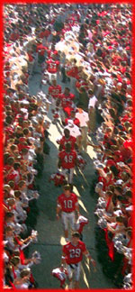
2 Responses to 'The obligatory uniform post'
Subscribe to comments with RSS
Dr. Krevel
August 22nd, 2011
2:56 pm
I love the helmet and the number font. That wide stripe on a silver base, with black G and red & black face mask. That’s just sick! I’d have no problem changing to that design forever. The all red jersey and pants, are sort of retro with the black treatment to the upper sleave. I have no problem with it.
Traditionalists need to get over it. I love our traditional uniforms and personally think they’re one of the best looking in college football. However, I think it’s fun to change-up every once in a while and this game against Boise St. presents the perfect opportunity to add additional excitement to the event.
James
August 22nd, 2011
4:55 pm
Red. Spread the Red. Most investors and business people have seen all the “red” they want lately. Sorry, but I’d like for my financial returns to be in the black. Same goes for those Dawgs.
Like to see a change in uniforms. Prefer something from Russell. Have not liked Nike since the Diamond Dawgs used their bats in the season we lost the CWS championship game.
The head gear is just bad. Could they have not put some black piping and etc on the jersey or trousers.